Rocketing SpaceNed’s global visibility,
online and offline
SpaceNed is a trade association that brings together the major players in the Dutch space industry. As an institution representing a broad spectrum of Dutch space organisations, SpaceNed’s mission is to promote Dutch space innovations and technologies. To achieve it, SpaceNed creates partnerships and open dialogue between national and local governments, agencies, commercial businesses, universities, and scientific organisations.
SpaceNed facilitates and supports its 40 members with lobbying and networking, media relations, export missions, seminars, and knowledge exchange.
Seeing that SpaceNed had ambitious plans to reach a wide range of international stakeholders, as well as to communicate a more cohesive and versatile message, they decided to rebrand, and called upon Bright8 to assist them.
Strategic Positioning
In our usual way to get to know our clients, we started with a brand immersion session to learn all about SpaceNed’s needs, background, services, and ambitions. After meeting with them, we got a better sense of SpaceNed’s complex stakeholder landscape. We then conducted desk research to get a complete picture of the space international business, challenges, and opportunities. Our next step was to create an external and internal analysis of SpaceNed’s business environment along with the benefits and values.
From there, we identified the unique elements that SpaceNed brings to its members and to the international space community. This helped us to craft the final positioning:
SpaceNed supports and facilitates the Dutch space sector by creating a long-term and durable vision on how all members of the industry can work together and advance both their common and individual interests. It also develops opportunities for networking, knowledge sharing, lobbying and business. SpaceNed rockets the competitive position of the Dutch space sector within the international space landscape.
Rebranding
Based on the positioning and the research, the Bright8 team developed for SpaceNed a new brand identity that gives a more global perspective to the Dutch space industry’s initiatives, as well as how the brand promotes SpaceNed’s activities. An important part of this message was the benefit space technology has for international communities.
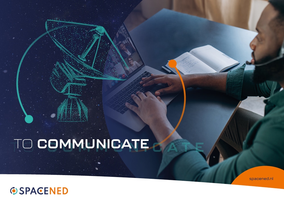
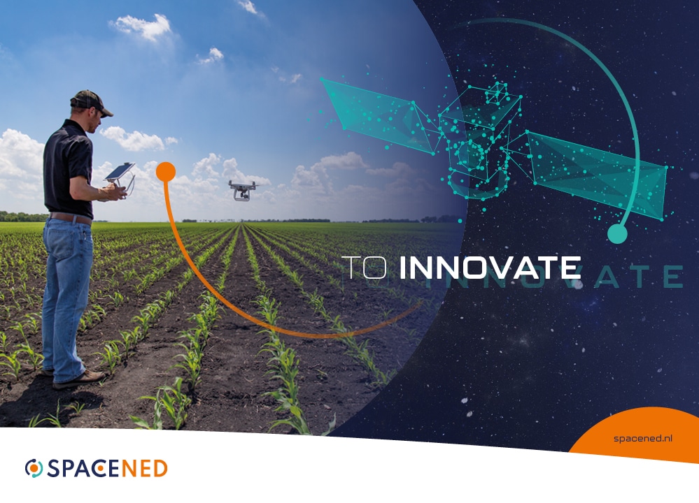
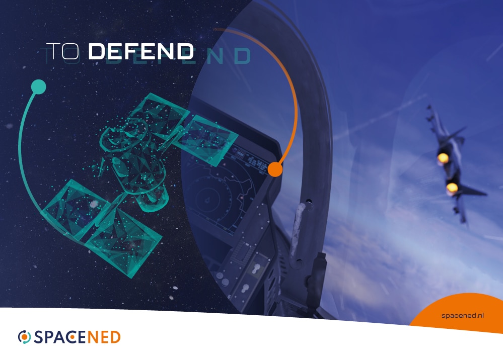
As part of the new branding, we identified space pillars that are core to SpaceNed, and that show the benefits of space to the audiences:
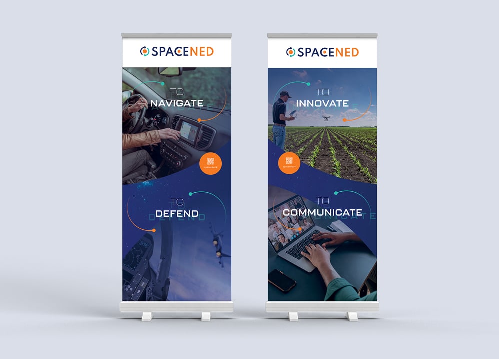
- To navigate; satellites provide important pieces of information to facilitate mobility.
- To communicate; phones, internet… Space innovations enable most of our communications.
- To innovate; by providing important data on the world around us, satellites lever innovations across all industries.
- To defend; space technologies enable us to protect ourselves better.
We developed SpaceNed’s brand visuals around these 4 important elements.
Brand ID and Smart Visuals
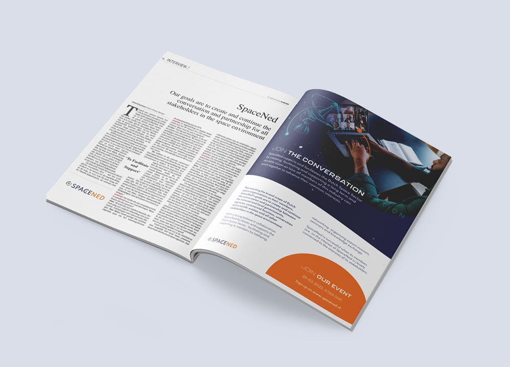
According to our approach, words are important, but creative design can express emotions that go beyond that. If fashioned with care and coherence, great visuals are critical for communicating the key messages to the right person.
This is why, as part of SpaceNed’s new global strategic approach, we designed a whole corporate visual package to roll out the brand ID. This includes a new logo, roll-up banners and a website.
Logo and Graphical Charter
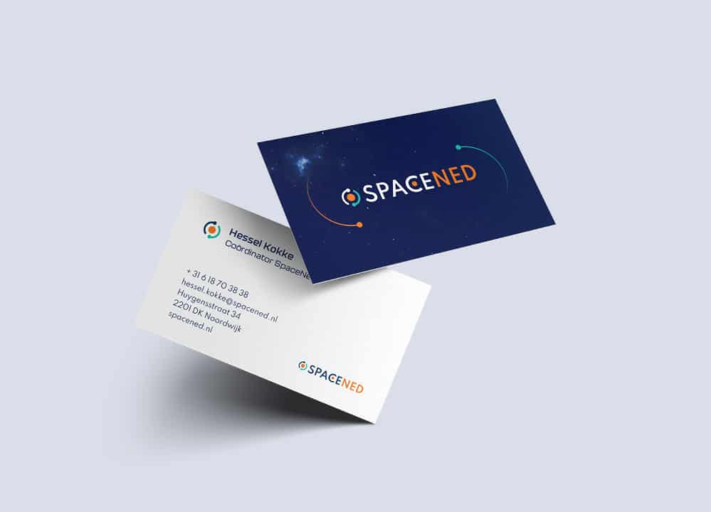
To match SpaceNed’s new visual identity, our in-house studio developed a new logo using blue colour that reminds of space, orange to represent the Netherlands, and a turquoise blue that stands for technology. Two planets are represented. The first one, surrounded by an upstream, downstream element, and the second, in orbit in the ‘C’ of SpaceNed. This new look aims to represent the fusion between the Netherlands, the space industry, and the technologies, together creating endless innovations and possibilities for humankind.
To Implement a new company identity, logo, and internal communications, we fashioned materials such as roll-ups, shirts, etc., for trade missions and external presentations.
Website
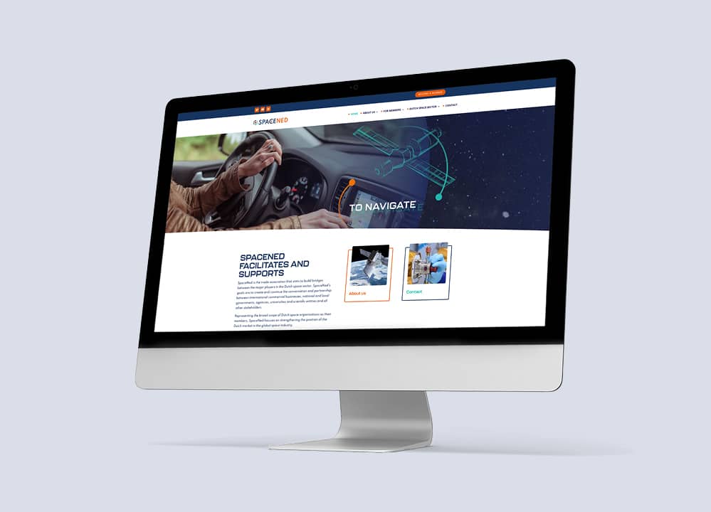
When it comes to repositioning, launching a new website is one of the first steps to convey the right message and gain credibility among stakeholders.
In keeping with SpaceNed’s new positioning, our in-house studio mapped the information to improve the user experience and online navigability thanks to UX research. Along with that, our designers developed a creative website, encompassing SEO-powered content, stunning visuals, and great look and feel.
The purpose was to create SpaceNed’s new positioning as well as a long-term communication strategy to help them reach for the stars.

SpaceNed is a trade association that brings together the major players in the Dutch space industry. The institution helps its 40 members with lobbying and networking, media relations, export missions, seminars, and knowledge exchange.
