Streamlining social and student
housing management
we make it all better
Bright8 stands out at our ability to see our client servicing as a whole—with Hercules, this includes how we worked on the flow of the Dutch content. Migrated from the old site and sitemap, we made sure we upped the clarity of content flow, the organisation and the simplicity.
out with the old, in with the new
Hercules needed to upgrade and update their branding and presence. They also needed to redefine their place in the housing marketplace of tomorrow in a very competitive and fast-changing space.
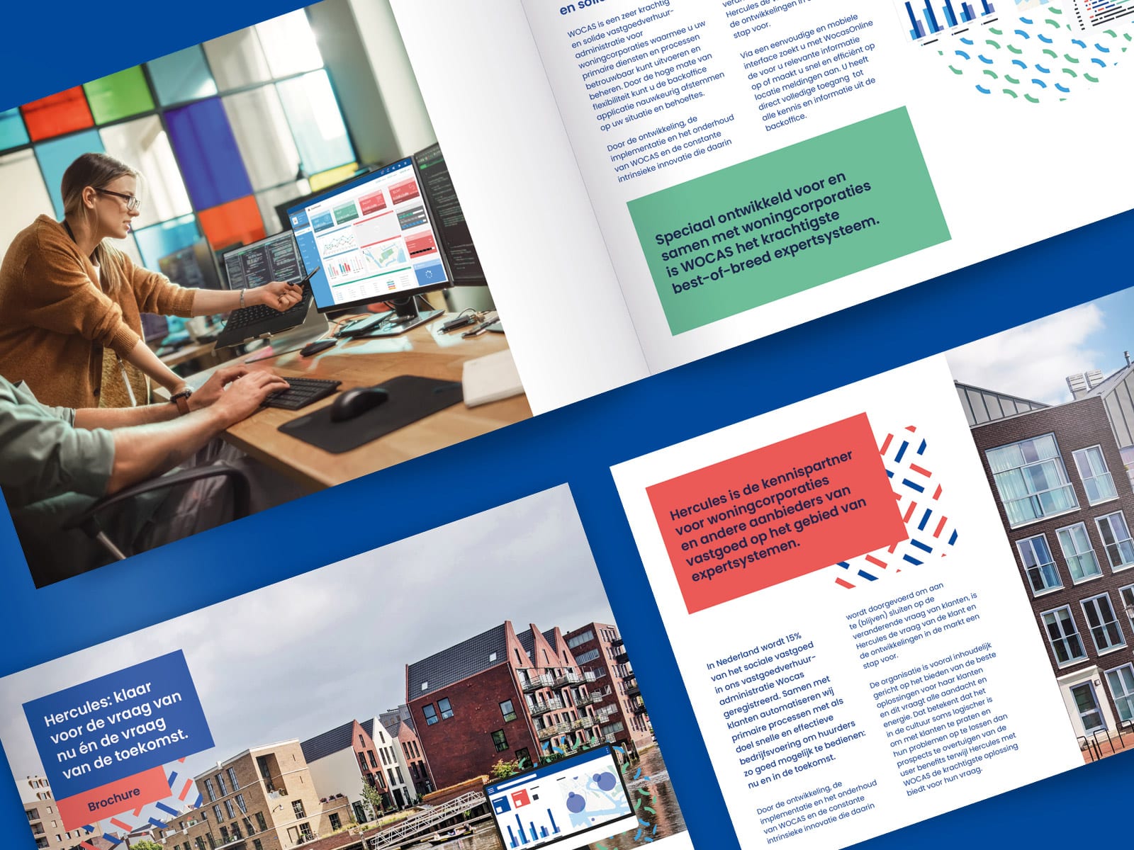
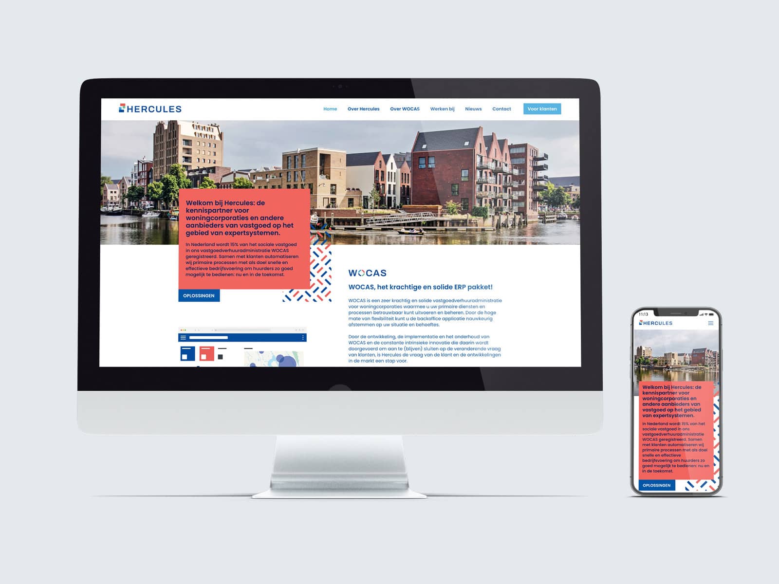
Our studio team developed strategy and positioning which included a comprehensive brand ID, logo re-design and concept, culminating in a brand-new website and marketing collateral.
Our expert positioning takes into account not only of the stakeholder objectives, but also the needs, preferences, and aspirations of the target audience. By understanding the target audience’s motivations and values, the rebranding can be tailored to resonate with them effectively—through relevant content, strong design and effective outreach. The social housing corporations in the Netherlands are nuanced but all seek to modernise its offerings—what better way than to modernise the branding of their most important software provider?
when the visual speaks with intent
The old logo badly needed an overhaul to reflect a more dynamic look as well as a sharp, bright futures. The motif of the house with pitched roof was outdated and flat.
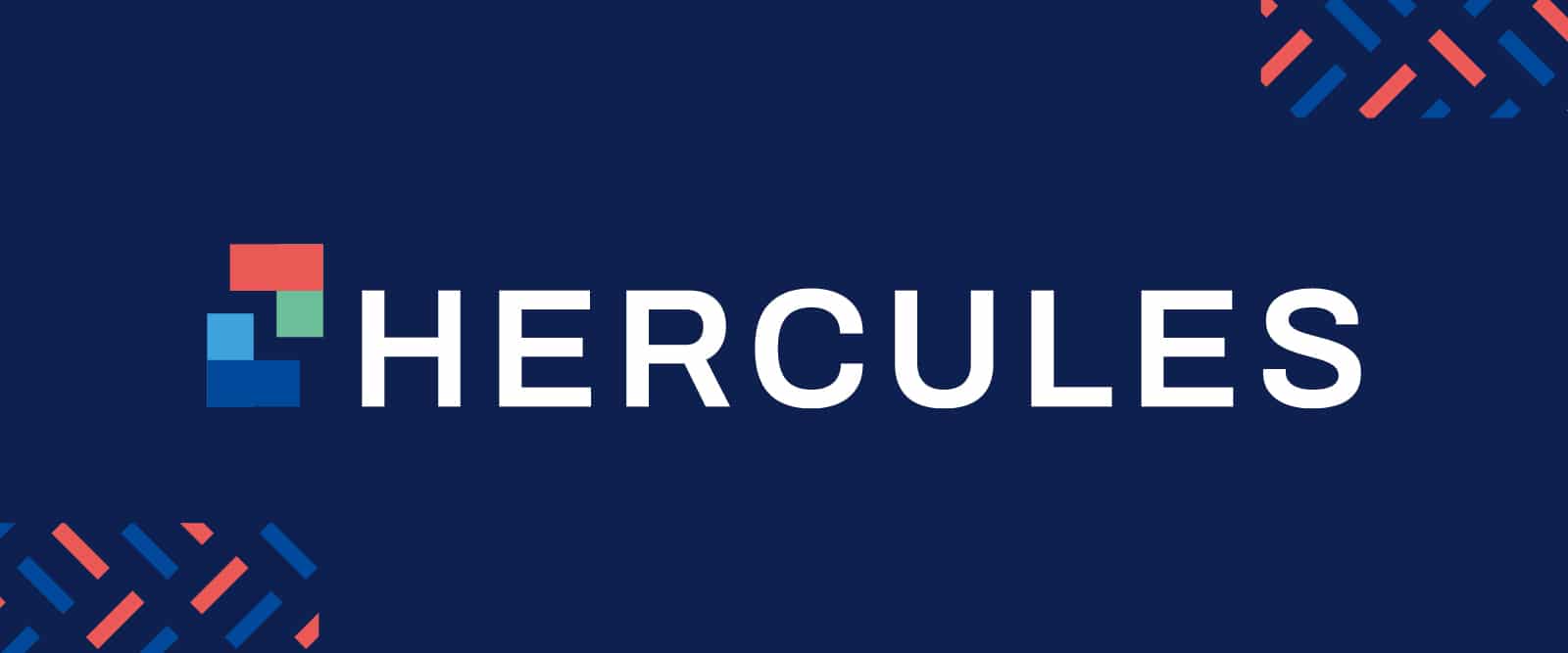
Our studio smashed it out of the park with the new logo for Hercules. Our simple yet evocative motif brought in many elements. The two separate pieces represent floorplans of a living space. These pieces can be Tetris-ed to make many configurations as a whole—but also exist as separate pieces. The two opposite each other represents life in a community—rather than an isolated, disconnected experience. This community living is further emphasized by the alternate pattern tilling we designed for Hercules, mirroring the thousands of apartment blocks dedicated to social housing in the Netherlands.
The two pieces opposite each other create a rectangle, which is echoed in the lettering of the Hercules name. Each san serif letter echoes the shape of the motif and the font we chose is reminiscent itself of floorplans.
We chose colours that were warm, both to denote the Dutch concept of ‘gezellig’ (homely and cozy) and to indicate separate rooms (and functions thereof). We used a sharp green to bring in the element of sustainable living and the green outdoors.
As a whole, it is a pleasing, clean, sharp and modern representation of Hercules and the market segment it services.

Hercules Social Housing provides specialist software for housing corporations and student housing providers in the Netherlands.


