Amsterdam Center for Sex Workers
When strategy, design, content and re-branding create synergy
Our strength in strategising
One of Bright8’s strengths is our insistence in positioning ourselves as an internal branch of our client—to understand them from the inside so that we can communicate both to external and internal audiences. We took the time to listen to the needs, objectives, goals and pain points of the HVO-Querido’s stakeholders, including GGD Amsterdam.
After developing a multi-layered strategy for the client, we suggested a new name for PG292 which both clarified its purpose better as well as translated well at an international level. Amsterdam Center for Sex Workers (ACS) better reflects its raison d’etre, leadership and expertise not just within the Netherlands, but across the globe.
Teamwork at its best
This project required many layers of support and expertise—which Bright8 delivered. From strategy to marketing to copywriting to translating to graphic design to website design to website input. It was all hands on deck.
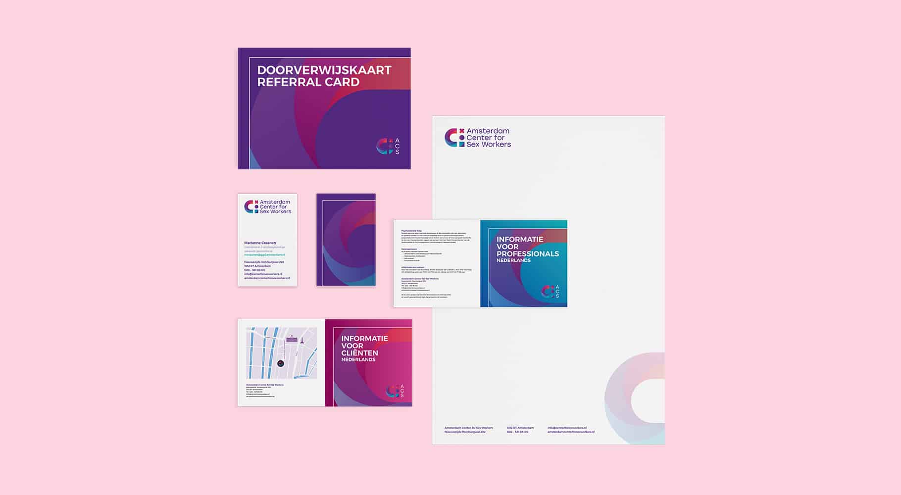
As always, our complete strategy included delivering a brand ID, positioning, marketing collateral, logo and signage. Our collateral included folders (for clients and business partners), business stationary, appointment and results cards.
We rebuilt the website from the ground up and website content in three languages. We’re proud that our content is not machine translated, but human powered by our English, Dutch and Spanish copywriters. The result is a fully functioning, robust website that is clean, intuitive and clear.
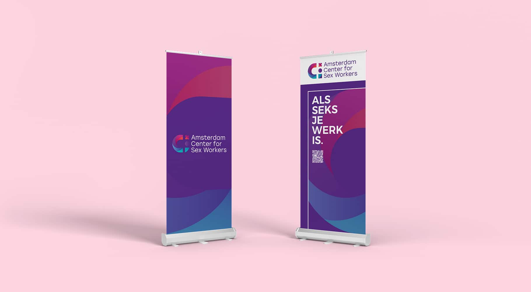
The team at Bright8 know how to work as a cohesive unit to deliver for our clients—who had planned a large launch party for the total rebrand. For the event, Bright8 also worked to deliver roll-up banners, balloons, signage and bespoke goodies for the grand opening.
The power of a well-thought-out design
Our clean logo design replaced an ambiguous and outdated logo. Strong pink, purple and magenta colours were chosen, in a ribbon rainbow motif.
Amsterdam is often represented by XXX symbol, seen on flags, buildings and manhole covers in the city. It is from Amsterdam’s official coat of arms. We took the three XXX and made it unique and meaningful for ACS.
In our iteration, the X stands for Amsterdam, the circle for the Center and the circle + the square together form the icon for the human being, representing both the sex workers and the employee network of ACS. The C represents the Center, connecting and encompassing all three elements.


